IS', Innovation, Synergy, Strategies, was the title of a project where I was tasked with designing a logo and visual identity for a brand facilitating consulting services in the petrochemical industry. "Modern" and "minimal" were the keywords the client approached me with, which kickstarted the design process.
Context
My role in this project involved designing the logo and visual identity. The brand, operating within the petrochemical sector and providing consulting services to related businesses, sought a redesign to establish precise visual standards.
I developed the logo, visual guidelines for cross-platform usage, app icons, typography, and corporate stationery. Below, you will see the entire journey—from the initial concept and logo formation to its final execution and implementation across various platforms.”
Details
Time Frame:
Feb 2025
Role:
Brand Identity Designer
Involvement:
Brand Presentation
Overview
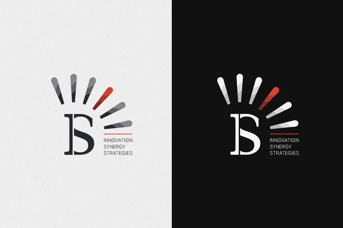
The client’s main brief focused on the acronym IS and the prime symbol (′), which is a mathematical abbreviation. My sketches and main focus were on the composition of these letters, aiming to create a visually appealing combination.
Challenge
The main challenge in designing this logo was the separation and combination of the mathematical prime symbol (′) with a classic font. I had to try to use classic English fonts while simultaneously maintaining a sense of modernity in the image. To begin with, I had to try to design the prime symbol in a special way so that it could, in a sense, become the brand’s emblem. The next challenge was that the brand’s long name had to be written in the logo, while also being consistent with the overall identity of the logo.
The central letters I and S represent the initials of the brand name: Innovation Synergy Strategies.
This bold yet simple combination serves as a memorable and recognizable visual identity.
Above the logotype, a visual element inspired by the mathematical prime symbol (’) is used. This mark has been stylized to radiate outward, creating a dynamic and energetic form. The radiating shape symbolizes:
- The spread of innovation
- Growing energy
- Connection to the surrounding world
- Forward movement
The brand’s color palette is based on two principal colors, Charcoal and Warm Red, strategically chosen to shape the visual identity through deliberate contrast.
The Charcoal color was selected for its ability to convey a sense of classic gravity, quality, and elegance; it provides the necessary depth to align with the nature of traditional fonts. In contrast, Warm Red serves as the opposing, accent color, which not only projects energy, dynamism, and warmth, but was also purposefully chosen to modernize the image and highlight specific graphic elements, such as the prime symbol.
This dual combination, where Charcoal represents roots and stability and Red signifies the distinctive, forward-looking element, directly addresses the main logo design challenge of balancing classic authenticity with a modern feel at the visual level. The secondary colors in the palette are also deeper, more saturated shades of these two main poles, ensuring visual coherence.
Results
This project was a serious challenge from the start: How could we combine the IS and the prime symbol with classic fonts while maintaining a completely up-to-date and modern appearance?
We focused entirely on the prime symbol, transforming it into the unique and primary emblem of the brand. Ultimately, we created a logo that possesses both the authenticity and credibility of a classic brand and conveys the energy and appeal of a modern visual identity to the audience. This logo successfully and simply shouts out the complete and distinctive identity of the collection.